You might have seen these images daily, but did you know they might hide something under them? A brush that can act as a bottle, ingenious things like a hidden door leading to a secret room, and more. And imagine that, if one day you discover those exciting things, you will surely go from more surprised to unbelievable than ever. We’ve put together a list of these for you; let’s check them out!
1. Baskin Robbins’s logo
Who doesn’t know the eye-catching logo of this famous ice cream maker?Surely you will be surprised to discover many exciting things hidden. Looking closely, you will see that the pink color shows the two numbers, 3 and 1.
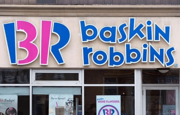
The ’31’ represents the number of original flavors the ice cream company started. It started in 1948 and was the first ice cream shop to introduce pre-purchase sampling. To this day, Baskin Robbins still pays homage to the original 31.
2. Toyota’s logo
All cars’ logos have a meaning, and Toyota is no exception. The three ellipses represent “unity between the customer’s heart and the heart of Toyota products.” At the same time, the white space on the background symbolizes “Toyota’s technological advancement and boundless opportunities ahead.”
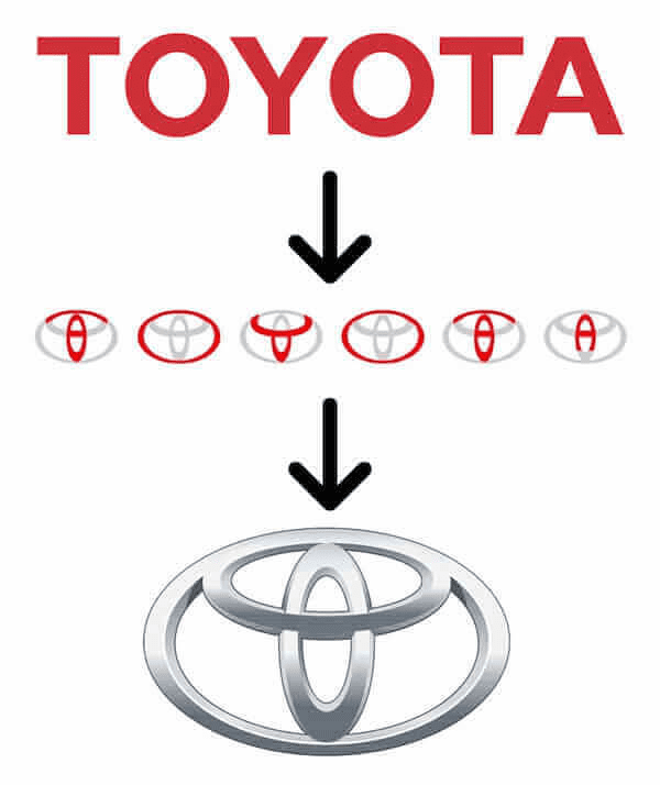
Others also think that the logo looks like a thread through the eye of a needle, symbolizing Toyota’s origins in the textile industry. Do you think this makes sense?
3. Amazon’s logo
The brand’s logo shows arrows moving from A to Z, which is relatively simple and easy to remember. However, Amazon’s logo was not always like that.

The first logo used when Jeff Bezos started in 1994 was nothing compared to it in terms of creativity. The logo has been modified as the company expanded its products and offered things other than books. It wasn’t until 2000 that they started using this.
4. Hershey’s logo
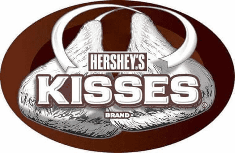
If you are looking for a gift with a hidden message, Hershey’s items will help you right away. The logo of their Hershey’s Kisses cookies is such that the “K” and the “I” meet to form the shape of one of the chocolate kisses. Although this logo is a recent development, it matches the shape of Hershey’s kiss that hasn’t changed since 1907.
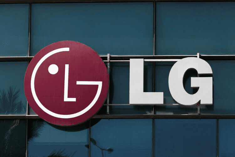
5. LG’s Logo
Have you ever noticed the logo printed on LG technology products? The LG Electronics logo looks like a winking emoji face at first glance. Looking closer, you will discover that G is the contours of the face while L represents the nose. According to some fans, LG’s logo resembles a modified Pacman.