Looks nothing like “R”
In an attempt to incorporate the Eiffel Tower into the word “Paris” by replacing the letter “R,” the designer missed the mark. Rather than resembling the intended letter, the tower’s shape more closely resembles the capital letter “A.”
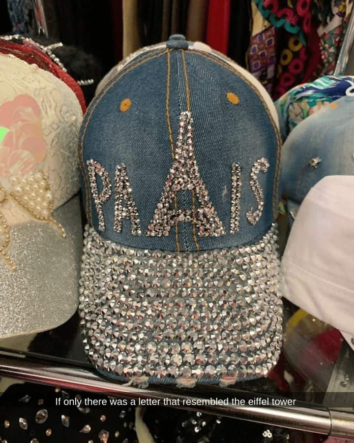
With countless design possibilities available, opting for a more fitting choice could have enhanced the overall aesthetic impact of the design. Attention to detail is crucial in ensuring that design elements align seamlessly with their intended representation.
Advertisement
